Beijing Air Quality: Statistical analysis using R
 |
ContentsOverview |
 |
 |
Overview
Beijing is known for being one of the most polluted cities on Earth. Often the government clamps down on private vehicles or barbecues in an attempt to control the air quality. However the effectiveness of these measures depends on the source of the pollution, in particular of particles smaller than 2.5 microns. These particles are the major cause of pollution related health issues in humans (e.g. here) and are mostly produced by combustion processes.
The concentration of these small particles is measured by the PM 2.5 index which will be examined here using hourly data from 2008 as measured by the US Embassy in Beijing (available here). To determine the origin of the pollution and examine how the city is cleaned the weather data (available here) for the same time period is examined. The statistical analysis is conducted using a self-written R code which is available here.
Raw data
|
The raw data for the PM 2.5 is shown with measurements taken hourly at the US Embassy in Beijing since 2008. Notice that there is missing data, particularly in late 2008/early 2009. Before analysing the data it must be cleaned. The data is cleaned by removing header files and keeping only validated rows of data when the meter is operating correctly. Then the data for each year is combined into a single file. In the case of the weather data this involved changing imperial units to standard units for years before 2011. |
 |
Seasonal variation
|
The yearly average of the daily mean PM 2.5 level for Beijing has not strongly changed since the Olympics in 2008 (see table below) so all years can be analysed together without introducing significant bias. All PM 2.5 data for each year is combined into the plot to the right to show the seasonal variation. The mean PM 2.5 value is basically constant throughout the year; however the maximum value is far higher during the winter. This is despite Beijing having occasional strong winds from Mongolia during this season. The reason for this is increased coal burning in the city (and surrounding area) required for heating.
|
 |
Effect of special events
Previously we saw that the seasonal mean and the yearly means are generally constant. However there are certain events that are notable exceptions.
To demonstrate this, we first chose a typical time period (top left of the figure below) where the mean (solid black line) and daily minimum and maximium range (grey region) are shown against the date. The background colours show the different alert levels that nost people living in Beijing are familiar with via common phone apps. In summary; green is good air quality (PM 2.5 < 50 μg/m³), yellow is moderate (between 50 and 100), orange is unhealthy for sensitive groups (between 100 and 150), red is unhealthy (between 150 and 200), purple is very unhealthy (between 200 and 300) and dark red is hazardous (over 300). There is sometimes another level above 500 which is now labelled "beyond index" rather than the more commonly used "crazy bad". As another point of comparison the maximum concentration allowed in EU countries (25 μg/m³) is shown in each plot as a dashed horizontal line.
An example of a "crazy bad" day is shown in the top right panel. This type of event is now referred to as an airpocalypse, with this particular day the worst (so far) which occurred on the 12th of January 2013 (an example news report can be found here). For consistency dates are chosen in each plot such that each week begins on a Monday.
  |
  |
However there are certain events which do result in much cleaner air than average. The first example of this was the Beijing Olympics (8 - 24 August 2008), the pollution statistics are shown in the bottom left plot of the above figure. The second, more recent, example took place for the APEC meeting which was held on 10-12 November 2014. This event intentially had far cleaner skies than the previous (and subsequent) weeks and resulted in the slang expression APEC blue. For example, "He's really not that into you, it's just an APEC blue."
Correlations and origin of pollution
To examine the causes of the pollution and how it is eventually cleaned we seek correlations between the PM 2.5 values and the daily weather. As seen in the top two plots below there is no significant correlation between the temperature or the amount of rain and the concentration of PM 2.5 particles.
  |
  |
|
However there is a correlation seen in the wind speed in that an increase in speed is correlated with a decrease in the PM 2.5 concentrations. There is also a strange correlation with the wind direction. Both of these are examined in more detail below. As seen from the figures to the right the humidity also correlates with the air quality. The top panel shows the data on a logarithmic scale along with a parabolic fitting function while the bottom panel shows the same data and fit on a linear scale. The fit to the data can be approximately summarised as a two-fold increase in the humidity leads to a two-fold increase in the mean PM 2.5 concentrations. The correlation between humidity and pollution needs to be investigated further to determine any causal relationship. A first guest for this would be that during the summer the humidity comes on the wind from the south (the edge of the monsoon weather pattern), which is associated with high pollution. It can only be cleaned out by northerly, dry winds which are also associated with low pollution. See below for the wind analysis. |
  |
Wind analysis
As we saw previously the wind speed has a clear correlation with a decrease in the concentration of PM 2.5 particles. In addition the wind direction has a complicated relationship with the pollution level. Here these two factors will be analysed together.
|
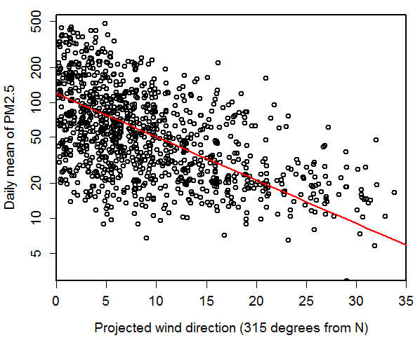
To combine these two data sets a vector composed of the daily wind direction and mean wind speed is constructed. The scalar projection of this vector on a comparison direction (say "north") is made and the result recorded. The results of this process are shown in the four figures below for two comparison directions; SE (135 degrees from North) and NW (315 degrees from North). So a data point that has a projected wind direction of 15 kph in the SE direction (top left panel) means that the component of the wind coming from the south east direction is 15 kph. As we can see from these plots the wind from the NW (towards Mongolia) is typically stronger than the wind from the SE (towards Tianjin city). This is also seen in the figure to the right which shows the daily mean wind speed against the daily mean wind direction for over 2008-2014. |
 |
  |
  |
|
To characterise the relationship between the PM 2.5 level and the projected wind speed in each direction a linear fit is made to the log plotted data for each comparison direction. While a number of other fit types were trialled, the fit was kept as linear for simplicity and consistency between comparison directions (directions with sparse data were troublesome). The slopes for each fit are shown against the projected direction in the figure to the right. Values close to zero indicate little to no dependence, while strongly negative values (such as that for the NW) show that the pollution decreases with increasing wind along the comparison direction. From this figure the strongest decreases in pollution were seen when the wind comes from the north to north east. |
 |
 |
However the slope of a fit to data can sometimes give misleading results. For example the PM 2.5 against projected wind direction for 135 degrees from N shows a cluster of data around 5 kph and 100 PM 2.5 with no clear trend. So even though a line can be fit it may not represent a true correlation. To distinguish these cases from true correlations the coefficient of determination was calculated for each fit, the results from which are shown in the figure to the left. This coefficient is zero for no correlation and close to one for a strong correlation. As seen in the figure this shows that for 135 degrees from N there is no real correlation, while for 335 degrees from N there is significant correlation. |
|
Since both the slope and coefficient of determination are useful in examining the effect of the wind on the PM 2.5 pollution level then both of these were combined into a single plot (right). The colour being set by the slope with green being maximum (negative) slope and red being close to zero slope (so no effect of increasing wind speed on decreasing pollution). The transparency (visible as how pale each colour is) shows the coefficient of determination, with wind directions with no correlation to pollution appearing as close to white. From this figure wind from the NNE direction is the most efficient at cleaning Beijing of PM 2.5, but any wind from the W to the NE direction can also clean the city. The strongest individual cleaning events are from the NW where the wind is the strongest (see above). |
|
Summary
The map below shows the annual exposure of PM 2.5 in each area as observed by satellite between 2008 and 2010. Data is taken from the Earth Observatory and this particular image is available here. Over this the pollution compass determined by this analysis is shown. Here we can clearly see that areas in directions of "cleaning wind" for Beijing are less polluted that average, while the SE of Beijing is heavily polluted. So wind from the SE would not be expected to clean Beijing, while wind from the NW (i.e. towards Mongolia) should clean the city, which is what we see on the pollution compass.
